Quikr
Electronics & Gadgets Redesign
Reshaping Exploration in Electronics
I redesigned the electronics category of Quikr.com to solve a unique UX gap: letting users explore cross-category gadgets under a shared budget with clarity, speed, and trust.

Why this redesign matters
When I first landed on Quikr’s Electronics & Gadgets section, the issue wasn’t just an outdated interface, it was a broken experience from the ground up. Here's what I found:

Key User Pain Points
Fake & Misleading Ads
Many listings display counterfeit or irrelevant product images. This erodes trust immediately, especially for high-value items like smartphones and laptops.
Poor Categorization & Deep Navigation Trees
A user wanting to buy a phone needs to go through 3–4 layers before seeing relevant listings. That’s too much effort for an intent-driven action.
Low-Quality Visuals
The majority of product thumbnails are poorly captured, sometimes irrelevant. Visual clarity is essential when the product’s physical condition matters.
Lack of Trust Indicators
There's no real differentiation between verified and unverified sellers, no product condition grading, and no real-time support, making users feel unprotected.
Disconnected Product Info
Product details are scattered. You have to scroll and scan too much just to get a basic sense of specs and seller intent.
What Users Are Actually Saying
"Felt like gambling with my money every time I clicked a listing."
“No filters for screen damage, warranty, or even product age.”
"I just wanted to compare phones under ₹30,000, but it took forever to get there."
Key stats
4+ clicks
Average time taken to reach product page
~60%
% of product listings with poor or fake images
1 in 3
Users reporting scam/fake product experience
1.2 / 5
Trustpilot rating for Quikr
+12%
% conversion lift with verified seller badges (A/B test data)
2.5x slower
Time to find relevant electronics on Quikr vs Flipkart
>80%
% of product pages lacking verified seller info
~40%+
Abandonment rate in electronics journey (estimate)
Research & Discovery
How I Approached It
I started by questioning my own assumptions: Is Quikr’s problem really just a dated UI? As I dug in, it became clear, the bigger issues lie in trust, clarity, and effort.
To validate that, I conducted (Mini versions) :
A heuristic review of Quikr's electronics experience.
Competitor benchmarking across Flipkart, Amazon, OLX, Meesho, Cashify, Croma, and Reliance Digital (Manual Checking).
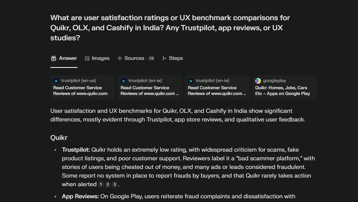
User reviews, survey data, and third-party research for pain points (Used AI to get data from different website and applications like Trustpilot, Google Play store etc).
Market behavior studies on second-hand electronics platforms in India (Understood how other platforms like Cashify are doing) .
User Personas
Understanding who's using Quikr for electronics gave me key design anchors.
Rohan
The Budget Tech Seeker
Age
26
City
Pune
Goals
Wants a used iPhone under ₹25,000 with decent condition and quick delivery.
Frustrations
Doesn’t trust most listings, struggles with vague product details.
Priya
The Comparison Shopper
Age
33
City
Jaipur
Goals
Compare tablets across brands under ₹40,000.
Frustrations
Too many irrelevant results; filters feel outdated.
Akash
The First-time Seller
Age
40
City
Delhi
Goals
Sell an old gaming console at a good price and quickly.
Frustrations
Gets spam calls after listing. Doesn’t understand premium ad benefits.
Competitor Research (in India)
I benchmarked leading players to identify what they do differently—and better.
Platform
What They Do Well
Gaps |
|---|
Cashify
Verified refurbished listings, quality checks, trust-focused UX
Price manipulation concerns, inconsistent service
OLX
Familiar model, quick listing
Still suffers from scams, spam, and poor image listings
Methods, User Experience & Drop-Offs in E-commerce platforms (General)
Workflow Area
Amazon
Flipkart |
|---|
Meesho
Reliance Digital
Croma
Navigation
Mega Menu, Rich filters
Mega Menu, Rich filters
Basic, sometimes cluttered
Directory, multi-layer filters
Traditional, grid listing
Filtering
Extensive, Advanced.
Extensive, Advanced.
Limited, inconsistent.
Brand/price/spec/EMI.
Basic filters.
Product Info
Detailed, rich reviews, loyalty offers
Detailed, rich reviews, loyalty offers
Sparse/poorly formatted
Detailed, EMI and warranty
Standard, few reviews
Checkout
Multi-seller, fast, trackable
Simple, loyalty integrations
Simple, Online Payment preferred
Hybrid pickup + delivery
Clear, offline integration
Strengths
Breadth, trust, UI
Offers & Trend-driven, easy compare
Price, COD, simplicity
Offline+online, after-sales
Offline trust, store pickup
Main Pain Points
Choice overload, Cluttered UI
Choice overload, Cluttered UI
Product quality, UI clutter
Less dynamic online structure
Poor online comms, reviews


Solution Exploration
After identifying the real problems (fake listings, poor categorization, and lack of trust), I explored multiple solutions from both a UX, AI, and trust-building perspective.
Solution Approaches Considered
AI Smart Search Mode
Let users type what they’re looking for in natural language.
For example, "1.5 Ton White AC under ₹30,000” and use AI to parse filters & show exact matches.
Better Categorization & Navigation Flow
Flatten the navigation structure and introduce a clear “Electronics & Gadgets” mega-section, like Flipkart. Reduce product discovery to max 2 clicks.
Trust-First Product Cards
Show high-quality thumbnails (not just seller images, we can add product shoot images), add verified seller tags, badges like “Good", "Superb", "128GB" etc. for the user to understand faster.

AI search mode

Interactive Product Cards
Expected Outcomes
40%
Reduction in fake listing engagement
+25%
Search-to-click rate
~4.0
User trust score (based on Trustpilot etc.)
~2.5 mins
Avg. time to find a product
Electronics & Gadgets Page

Specific Product Page
